Introduction to CSS Transitions
What are CSS Transitions?
CSS Transitions allow changes in CSS property values to occur over a specified duration rather than happening instantly. This makes visual changes smoother and more appealing.
Transition Properties:
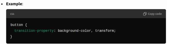
- Transition-property:
- Defines the specific CSS properties that will change smoothly (e.g., background-color, transform, width, opacity).
- If multiple properties need transitions, they can be listed, separated by commas.
- Default: all (all properties will transition).
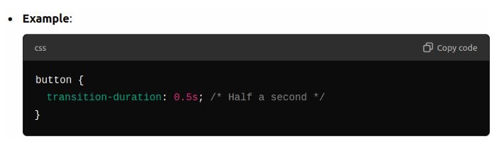
2. Transition-duration:
- Specifies how long the transition should take to complete (e.g., 0.5s for 500 milliseconds).
- If different properties have different durations, they can be listed in the same order as transition-property.
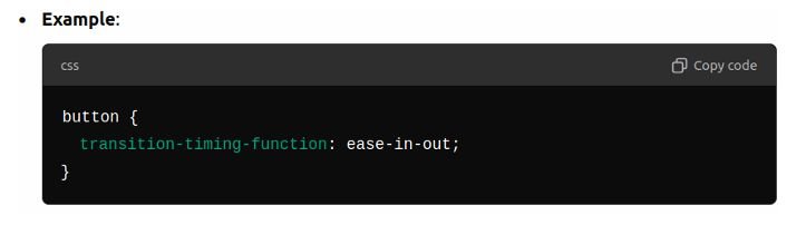
3. Transition-timing-function:
- Defines how the intermediate states of the transition are calculated. Common values are:
- ease: Start slow, speed up, then slow down (default).
- linear: Constant speed from start to end.
- ease-in: Start slow, then speed up.
- ease-out: Start fast, then slow down.
- ease-in-out: Slow at both the start and end.
- Cubic-bezier functions: Custom timing functions like cubic-bezier (0.25, 0.1, 0.25, 1).
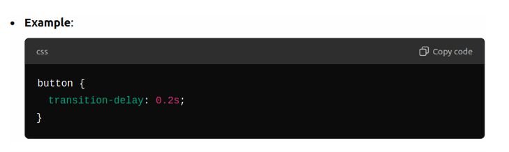
4. Transition-delay:
- Sets a delay before the transition starts (e.g., 1s will wait 1 second before starting the transition).
Hover Effects and Pseudo-Classes
What is the :hover Pseudo-Class ?
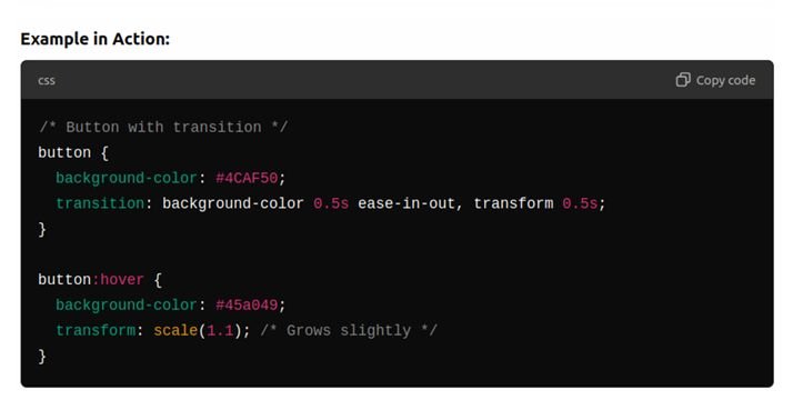
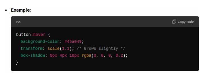
The :hover pseudo-class applies styles when the user hovers over an element (e.g., buttons, links, product cards). It’s widely used for interactive effects.
It can be applied to any element, not just links.
Examples of Hover Effects:
Hover on Buttons:
Change background color, add shadows, scale up the size, or change the text color on hover.
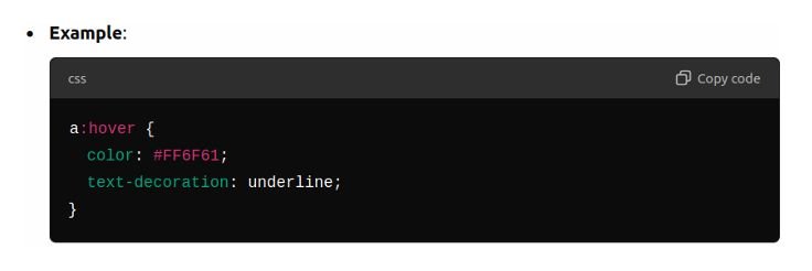
Hover on Links:
Change the color or underline the text.
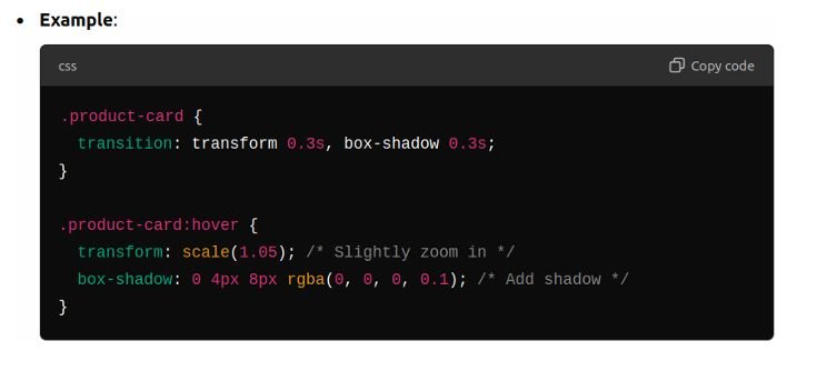
Hover on Product Cards:
Apply hover effects to product cards to increase the scale slightly, add a box shadow, or change the border.
Creating Hover Menus on Product Cards
What is a Hover Menu?
- A hover menu is a hidden element that becomes visible only when its parent (e.g., a product card) is hovered. Common uses include quick view, add to wishlist, and compare buttons on product cards.
Introduction to CSS Animations
What are CSS Animations ?
CSS animations allow the values of CSS properties to change smoothly over time, using keyframes. Unlike transitions, which define changes between two states (e.g., normal and hover), animations can define multiple stages and apply more complex effects.
Key Concepts of CSS Animations:
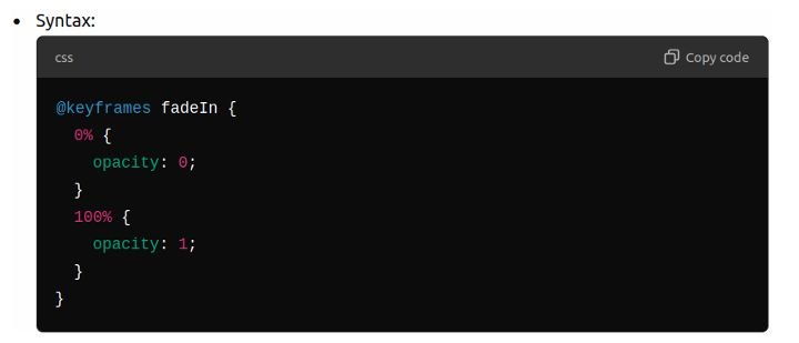
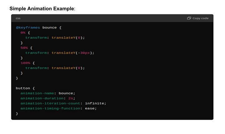
1. @keyframes:
- @keyframesdefines the stages of the animation.
- Each keyframe represents a percentage of the animation duration (0% is the start, 100% is the end).
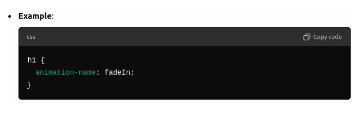
2. Animation-name:
- Specifies the name of the @keyframes animation to apply to an element.
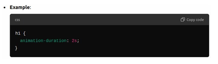
3. Animation-duration:
- Specifies how long the animation will take to complete (e.g., 1s for 1 second).
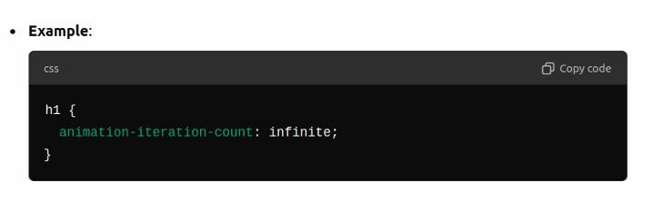
4. Animation-iteration-count:
- Defines how many times the animation will play (e.g., 1, infinite, or an specific number).
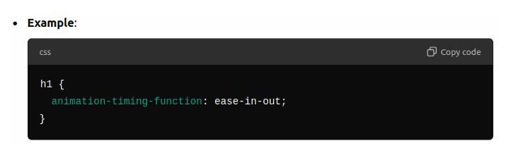
5. animation-timing-function:
- Specifies the speed curve of the animation (similar to Timing-transition-function).
- Common values are ease, linear, ease-in, ease-out, and ease-in-out.
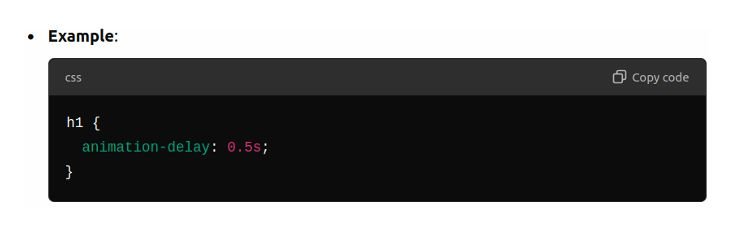
6. Animation-delay:
- Sets a delay before the animation starts.
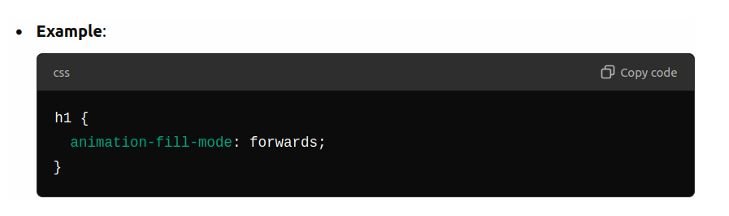
7. Animation-fill-mode:
- Defines what styles should apply to the element before and after the animation. Common values:
- forwards: Retains the final state of the animation.
- backwards: Applies the starting styles during the delay period.
- both: Combines both behaviors.
very nice tutorial