Understanding the basics of Flexbox, a powerful CSS layout tool used to create responsive and flexible layouts. how to use Flexbox properties to align, distribute, and order elements on a webpage.
Introduction to Flexbox
What is Flexbox?
- Flexbox (Flexible Box Layout) is a CSS layout model that allows you to arrange elements in rows or columns, distribute space, and align items.
- It simplifies creating flexible, responsive designs compared to using floats or manually setting margins.
How Flexbox Works
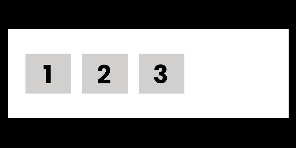
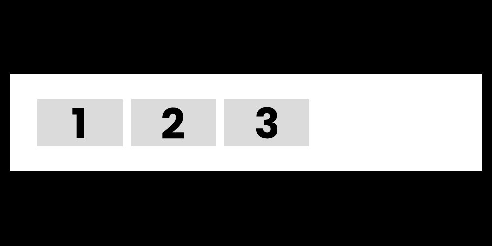
- To use Flexbox, you need to set a container’s display property to flex, making the container a flex container, and its direct children become flex items.
Basic Flexbox Terms
- Main Axis: The primary axis along which the flex items are laid out (can be horizontal or vertical).
- Cross Axis: The axis perpendicular to the main axis.
Explanation
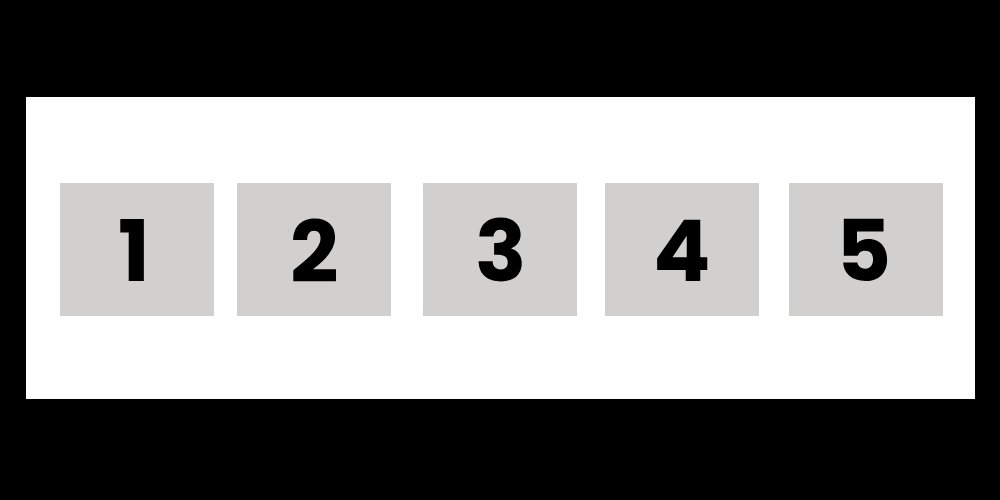
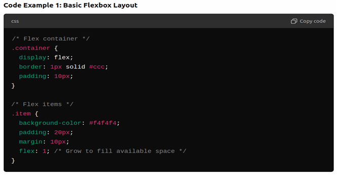
- The .container is set to display: flex, making it a flex container.
- Each .item becomes a flex item. The flex: 1; property makes the items grow equally to fill the available space.
Flexbox Properties for Containers
- flex-direction
- Specifies the direction of the flex items (row or column).
- Values: row (default), column, row-reverse, column-reverse.
- justify-content
- Aligns flex items along the main axis (horizontally by default).
- Values: flex-start (default), center, flex-end, space-between, space-around.
- align-items
- Aligns flex items along the cross axis (vertically by default).
- Values: stretch (default), center, flex-start, flex-end.
- flex-wrap
- Allows flex items to wrap onto multiple lines.
- Values: nowrap (default), wrap, wrap-reverse.
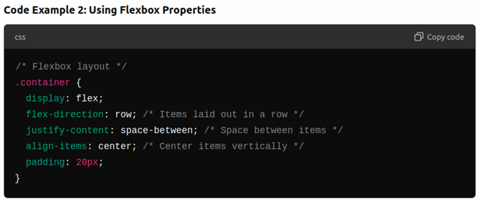
Explanation
- flex-direction: row; arranges the flex items horizontally.
- justify-content: space-between; distributes space between the items, ensuring equal space between them.
- align-items: center; aligns the items vertically in the middle of the container.
Flexbox Properties for Flex Items
- flex-grow
- Controls how much the flex item grows relative to the others.
- Values: Any number (default is 0, meaning no growth).
- flex-shrink
- Controls how much the flex item shrinks relative to the others.
- Values: Any number (default is 1, meaning items shrink as needed).
- flex-basis
- Defines the default size of the flex item before any growing or shrinking.
- Values: Can be a length (e.g., 100px) or percentage.
- order
- Specifies the order of the flex items. Lower numbers appear first.
- Values: Any number (default is 0).
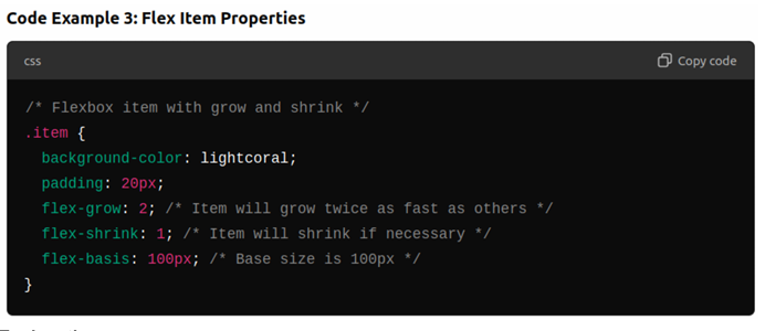
Explanation
- flex-grow: 2; makes the item grow twice as fast as other items with flex-grow: 1.
- flex-basis: 100px; sets the initial size of the item to 100px before applying growth or shrink.
Responsive Design with Flexbox
Making Layouts Responsive:
- Flexbox simplifies building responsive layouts that adjust to different screen sizes.
- By using Flexbox and media queries, you can change the layout for smaller devices.
Explanation
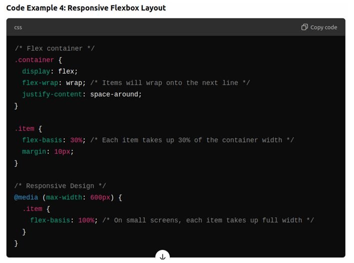
- flex-wrap: wrap; allows the items to wrap onto the next line if there’s not enough space.
- The media query adjusts the layout on small screens (e.g., smartphones), setting flex-basis: 100%; to make each item take up the full width.
Building a Responsive Navigation Bar
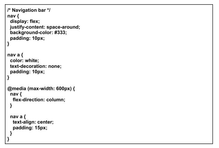
Use Flexbox to create a responsive navigation bar
- Create a navigation bar with links for “Home”, “Products”, “About”, and “Contact”.
- Use display: flex; to align the links in a row.
- Add a media query to stack the links vertically on smaller screens.
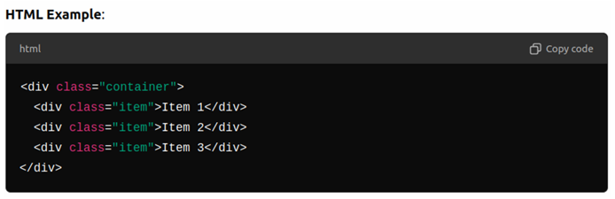
Code Example:
Very helpful tutorials
Nice
very detailed information
Amazing Content
nice blog
Beautifully designed
An incredibly well-written article.